
The language of design: Exploring UX design and its impact
by Nathaniel Blackburn
The internet is brilliant. It is a source of seemingly infinite knowledge and the spiritual home of cats. Yet, it is not without its problems and challenges. At the core of the internet are websites, primarily designed for providing information. But what if I told you these websites could be communicating something else entirely?
As humans, there is something that connects us all, and when we use it, we can unite, develop understanding and accomplish incredible things. That thing is language. While we usually communicate through text and speech, there are other methods, such as the use of color and symbolism.
When we discuss websites with others, we share our experiences and feelings about using them. We call this “user experience” or simply “UX” design.
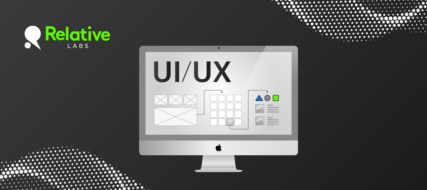
But how does this relate to design? Well, there is a particular type of design called “UX design.” While user interface (UI) design focuses on the appearance, UX is all about how it feels.
You can think of it as a sort of jigsaw. With each piece, we are hinting or conveying something to the user. Because of this, we need to be sure we are consistently saying the right thing.
Shape and color: The cornerstones of UX design
Colour is a powerful tool. With it, we can invoke emotions, moods or give something a sense of importance. Although, you should also keep in mind that not everyone perceives color in the same way.

Take this red rectangular button. On the surface, it seems harmless, but there’s an issue we might overlook – the red color is associated with danger. Subconsciously, we are suggesting that clicking it will have negative consequences. When coupled with square edges, the effect is amplified. This is because we link sharp things to pain.
Upon closer examination, armed with this knowledge, we realize we are looking at a button that screams danger with a label that presents a very different narrative. Confusing, right?
By giving the button rounded edges, we can shift the focus to what’s inside it, rather than the button itself.
The customer journey: Cause and effect
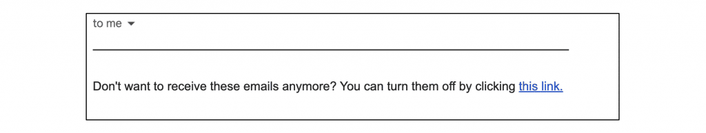
In this example, we have an email that we no longer wish to receive. As you can see in the picture above, we have a message at the bottom of the email telling us we can do just that.
Clicking the link leads us to a form where we’re asked why we want to unsubscribe. We give a reason, and we are finally unsubscribed. But it doesn’t end there, as another email arrives asking if unsubscribing was an accident.
Let’s unwrap this and identify what is wrong with this interaction from a UX design perspective. The first issue is that explicit actions should be as frictionless as possible. It’s unlikely for someone to click the unsubscribe link by mistake, as it’s usually tucked away and hard to find.
The second mistake comes after the action is performed. The intention was to stop email communication, so to receive another one contradicts the action and undermines confidence.
Respect your user’s autonomy by ensuring each action does what it suggests. If you need to collect reasons for unsubscribing, consider making it an optional step afterwards.
By keeping such actions simple and respecting user preferences, you build rapport with your users and put them in control.
Ensuring all pieces of UX fit together
These are just a few examples of how easily we can unintentionally convey the wrong message and negatively impact the overall experience. There are many more out there for you to discover.
However, by deconstructing the problem from a UX design perspective, we can position ourselves to make an informed judgement. So, when the time comes to put together the pieces of our experience, we can do so with confidence, knowing that everything fits.
At Relative Insight, customers’ satisfaction is our top priority, and we’re proud to continuously receive such positive feedback from you. Your support drives us to continuously improve and innovate in the field of text analysis, UX and UI.

Leave a Comment