
Relative Insight’s new Data Discovery

In the ever-evolving landscape of text analytics, finding meaningful insights quickly can feel like searching for a needle in a haystack… slowly! That’s why we’re excited to introduce Data Discovery, a ground-breaking product putting the power of data visualization at your fingertips.
Data Discovery (aka Data Disco) means you can find useful charts within four clicks of starting your work; that’s fast by the way!
Wow, that’s interesting! The visual potential of your data
At its core, Data Discovery is all about transforming your raw data into visually appealing, informative, and engaging representations at a rapid pace.
By harnessing the power of data visualization, you can bring your data to life to gain a deeper understanding. It’s like having a personal tour guide through the vast landscape of your data, enabling you to recognize trends and unearth valuable insights that might otherwise remain hidden.
Once you’ve discovered what’s going on in your data, you can shift your attention to specific areas and start digging deeper in Explore to learn more.
Accelerate your analysis: Insights in seconds, not hours
Traditional data analysis methods are often time-consuming and tedious. That’s why we developed Data Discovery to streamline your process and reduce the effort needed.
By eliminating unnecessary steps and simplifying the analysis process, Data Discovery empowers you to focus on what truly matters – making data-driven decisions that propel your business forward.
Effortless data import: Smart Uploads from smart people
The smart people at Relative Insight have built a proprietary tool, one of a kind in this space that allows you to throw any data set at our tool and we can instantly chew through it, organize, and clean it up!
With Smart Uploads simply drag-and-drop your data or connect it up for automatic scheduled uploads. Relative Insight’s intelligent algorithms analyze and streamline the process in just four simple steps.
Experience the capabilities of Data Discovery today
Discover new data visualizations
Once your data is uploaded, you will see a range of stunning visualizations, each capturing a unique aspect of your data.
Let’s take a closer look at the four visualizations that await you:
Relationship map
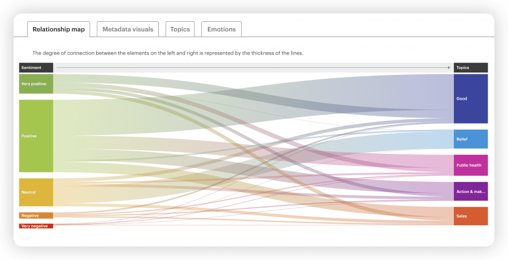
This diagram represents the connection between sentiment and topics. You’ll find the sentiment on the left, while five selected topics are showcased on the right. The lines that interconnect them allow you to explore and delve deeper into their relationships. The thickness of each line signifies the strength of the relationship.
Metadata visuals
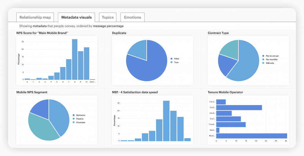
We visualize your unique metadata live. You can expect to see pie charts that categorize the data by gender, age, location, NPS rating, and more. These visuals provide invaluable insights into the defining characteristics and attributes that shape your data.
Topics treemap
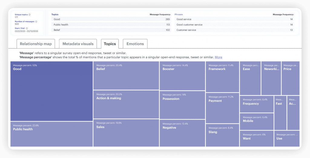
The topics are displayed based on their message frequency, giving you a clear understanding of their significance within your dataset. The more frequently a topic appears in your data, the more prominently it will be showcased on the treemap.
Custom Themes
By creating your own categories, you can focus the model on specific topics, words, and phrases, resulting in more accurate insights. Your pre-defined Custom Themes can be visualized in Data Discovery, offering a new level of understanding and exploration and the ability to create compelling reports that showcase your findings for sharing actionable insights.
Emotions overview
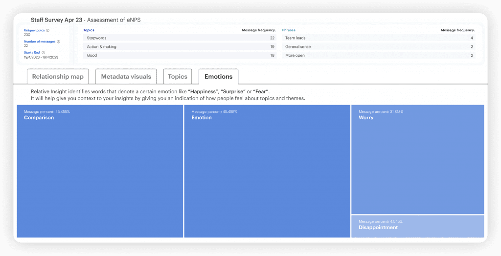
In the final tab, you’ll find an overview of emotions expressed within your data. By identifying words associated with specific feelings such as “Happiness,” “Surprise,” or “Fear,” this visualization offers context to your insights. Understanding the emotions surrounding various topics and themes can provide deeper insights into how people feel about them, enriching your understanding.
These Data Discovery visualizations serve as a high-level summary. They provide a visual roadmap, guiding you toward areas of interest, and paving the way for further investigating in Explore.
The Customer Dashboard: Your centralized hub for data management
Keeping track of multiple projects and data assets can be daunting. As a result, we have upgraded the Relative Insight platform to offer one centralized hub – the Customer Dashboard.
As an evolution of the Data Library, this user-friendly interface allows you to organize projects, manage data assets, and create new projects quickly and efficiently. You can access and oversee all your projects from a single location, making data management simple.
Enhanced decision-making and stakeholder communication
Data Discovery goes beyond just giving you a snapshot of the key trends in your data; it empowers you to make better decisions and communicate insights effectively.
By visualizing complex information, you can easily convey your findings to stakeholders, facilitating understanding and driving collaboration. Whether you’re presenting to the board or sharing insights with clients, Data Discovery equips you with compelling visualizations that bring measurable metrics to your text data and leave a lasting impact.
Relative Insight harnesses the power of data visualization to help you navigate through the maze of text analytics. With Data Discovery, you can embark on a data-driven journey that will change the way you understand and leverage your data. Check out our walkthrough video below to see it in action.